Airpods max should connect with the lightning cable, no?
Impressed so far with my very short play last night.
My TX-6 inputs and outputs showed up in whatever channels I configured it in (12 inputs and iPad speaker output). Can see this being a great travelling setup. Wonder if this opens the door for more sophisticated setups with Ableton note also?
1 Like
Nobody using the plugins would do such a poor design. It’s that bad.
It’s clear the Emagic guys have left Apple and Apple wanted to rush this.
Bad Apple!
1 Like
I hate that guy with a passion. It’s one of those influencers who doesn’t care about good software but only cares about hyping Logic.
“Everything you need to know” should be more like “I’m not gonna tell you what’s wrong with it”.
The issue is that the old plugins (and good UIs in general) made use of their position in 2d space to group functionality, indicate signal flow, and generally make the 20-50 parameters of complex devices make sense.
In these new “designs” there is no position, only order. They are a list of knobs laid out from left to right until they hit the edge of the screen then jump to the next line. The result is a jumble of knobs that give no hint as to their purpose or position in the signal chain apart from their title.
Apart from and in addition to the above, they removed many critical visualizations in the process. The pickup and pluck positions in the clav and Sculpture, the graph showing signal and reduction from the compressor. The visual representation of knee. Literally all metering and visual feedback from the multipressor.
Imagine if someone took a synth, even one you were very familiar with, and rearranged all of its controls so that they were in on long line, then removed all the screens. That’s the issue.
That and there’s no technical reason it has to be that way. It just seems like they ran out of time. Which is both sad but also a reason to hope they improve the situation.
Personally, I’ve been championing Logic’s built in sounds and FX for years, so I also felt like this was a good chance for a lot of people to get to know them in a context where they didn’t have all the 3rd party plugs they didn’t know they didn’t need  Alas!
Alas!
5 Likes
Unfortunately that’s not the case.
I was thinking the same thing when using some of the built-in plugins last night–that they seem randomly arranged–why is LFO there, what is it doing, what is it modulating, why is FM amount here, and not next to that over there.
This might just be true. It’s almost as if, with some of the plugins, the development team was told: here are the functions that need to be in the UI, with little or no guidance as to why or how the functions should be arranged. I actually want plugins to be more simple, and less “out there” than some of those older plugins from Logic for Mac (I like to look at but don’t like using the ES Plugins, and I don’t care about looking at, but do like using Omnisphere, Dune 3, Zebra and Serum). Visually pleasing as they were, some of those visuals in the Logic Plugins took away from function (Sculpture was a nice balance of cool looking and functional, given the incredible depth it has). Now, we are at the other end of the spectrum, where design has been removed almost entirely, which takes away from functionality. Hopefully, someone with a sense of signal flow will join the team and they will begin to rearrange things so they make more sense.
I am not complaining too much, though, since this is version 1.0.0. There’s lots of room for improvements, and I am still very excited that Apple has done this.
1 Like
There is this very universal design “normalization” trend in UI design nowadays, that’s fueled by overengineered design-thinking approach and occasional UX snake oil merchantry among the execs. Basically, every interface design has to follow the same rules and have the same design language. Which, when you think about it, is okay and actually good. But… However, sometimes context is more important than certain pseudoscientific UX paradigms and biased market research. Not every software product has to mimic some high performance web based CRM system. This is precisely what we see here.
2 Likes
Makes sense, but as @Elek4 stated above, it does seem like the UI design decisions in terms of layout for at least some of the plugins were done by people who have never actually used sound design (e.g. musical synthesis) software, so they don’t know how we who do use them, will interpret signal flow modifications.
Damn, this is a shame. I was hoping to use it this way too
This is great! Only 1 audio interface at a time or several can be used in same time?
You can use 2 (or more) and select from them, but only one can be used as output and one as input. you can’t agregate the inputs and outputs like on the mac.
2 Likes
That’s very cool


Yeah. Logic desktop gives us two views for every plugin. The “Editor” view that looks like this:
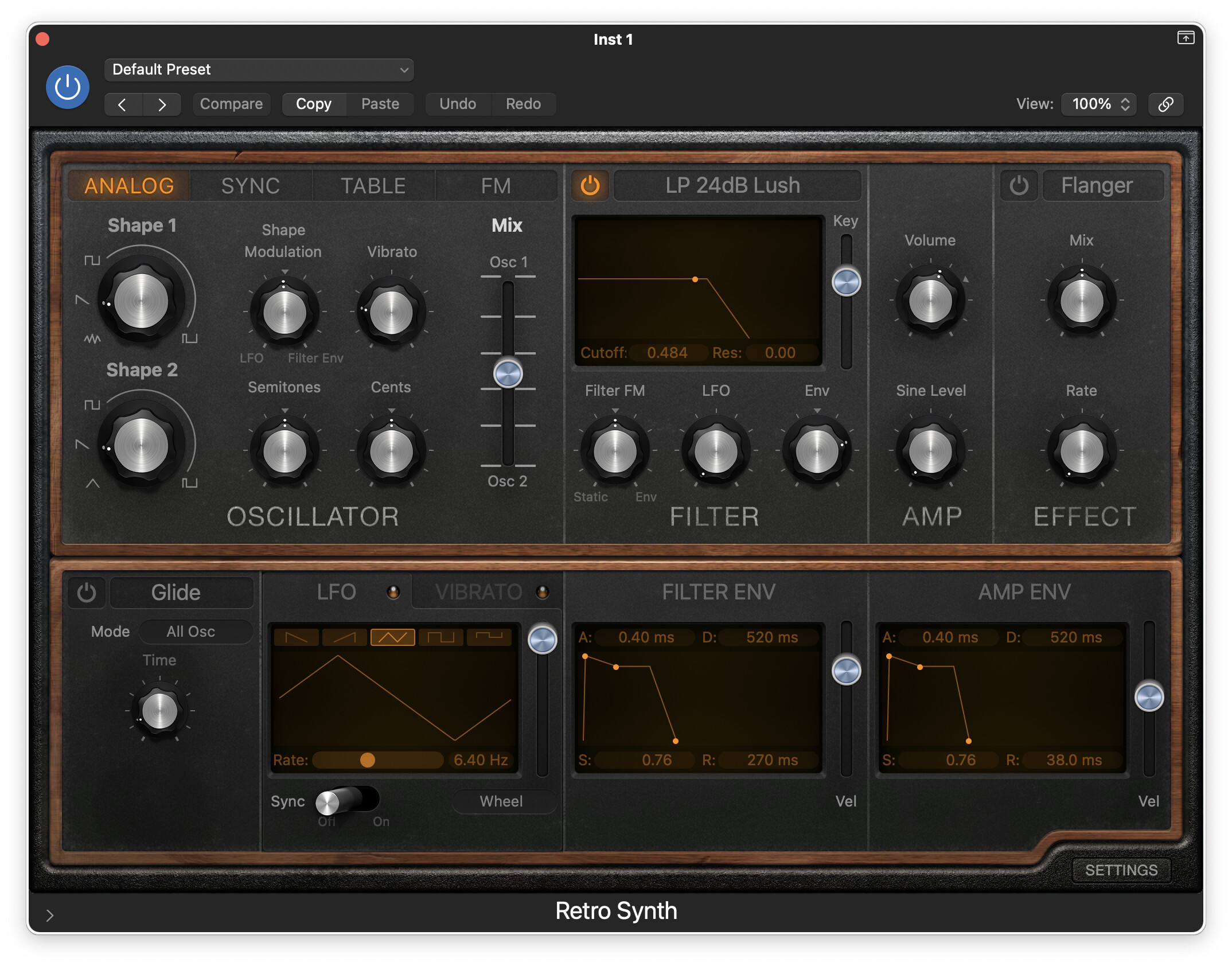
and the “Controls” view that’s just a long scrolling list that looks like this:
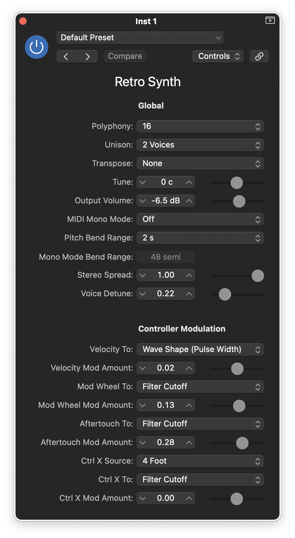
It’s like, for whatever reason, the native plugins for Logic iPad only include the “controls” interface. They didn’t make an “editor” ui for any of them.
Again, I hope this is temporary. They clearly put a ton of time into the rest of the UI and things like Beat Breaker, Sample Alchemy, and even the quick sampler. I think they just didn’t have time to do everything and these fell off the end. Or I hope that, anyway, because that means they’ll go back and give these proper UIs in an update.
1 Like
Good point. It’s funny, I just NEVER use the control view, even though, now that I look at it, there are advantages to it.
1 Like

Bluetooth delay? I’ve used my Max headphones with iPad DAWs and haven’t experienced anything noticeable. I wonder if it’s your environment? Do you have a big monitor nearby or a lot of other connected devices.
1 Like
Yeah. It’s great to have both. Less great to only have one or the other. Much less great if the one you get is the controls view 
1 Like
Nope. It does give a warning message when I select the AirPods that there could be a delay. Have you tried them with Logic?
1 Like