I prefer the old one!
Well this is awkward - I didnt know that squiggle on the roland logo was an R. Am literally staring at three of them in my studio… erm… Of course, now its all I can see.
2 Likes
Not a logo but I never understood the booger green tuning pegs!
1 Like
Love Glitchmachines! 

Glitchmachines Cataract 2 …

Glitchmachines Quadrant …
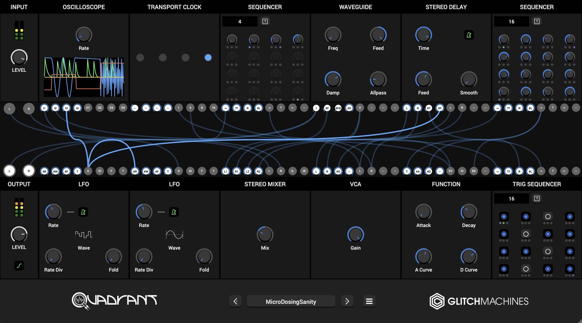
Glitchmachines Hysteresis …
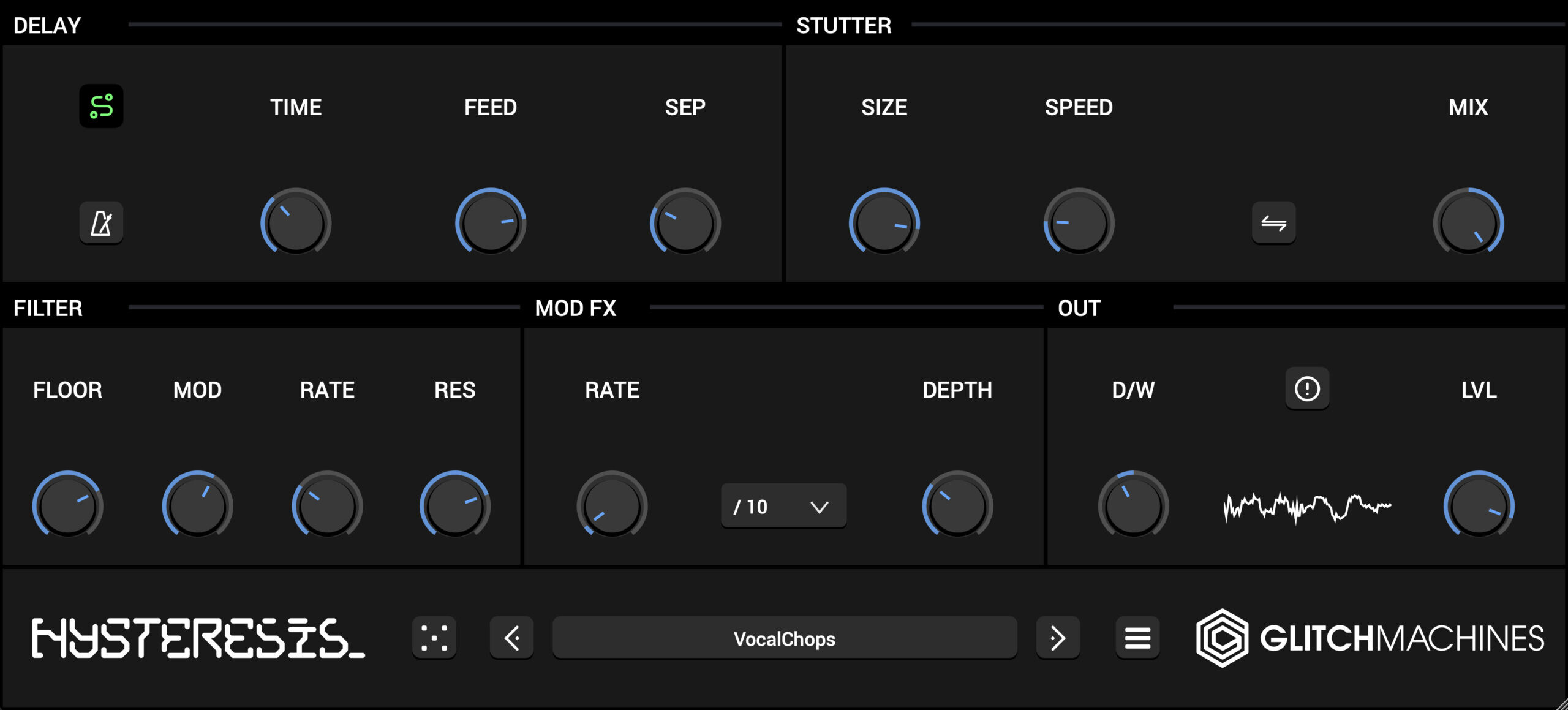
I think these logos look great! 
1 Like
I can’t see this one.
9 Likes
Looks like every logo from 1999
2 Likes
A piece of art
Sounds wonderful also, I had missed that one
1 Like
I like it
Agreed about old Arturia (still not a fan of that A, but at least the rest is gone), old ASM and Behringer logos, they just look kind of amateurish to me. Logo won’t stop me from buying if I’m really interested in a piece of gear, but it certainly helps keeping me from becoming interested lol.
I always liked Korg logo, the biggest it gets, the better it looks IMO, I don’t even know why lol.
1 Like

I thought it was funny, when I was a kid, the Roland logo defaced as such. Must’ve been the post Solidarity days or something

8 Likes
Love some easy graffiti.
Genuinely love this one
1 Like