I like the Erica Synths typeface and little alien. I like the Teenage Engineering logo to!
I maybe swimming against the tide though…maybe it’s a Gen X thing 
3 Likes
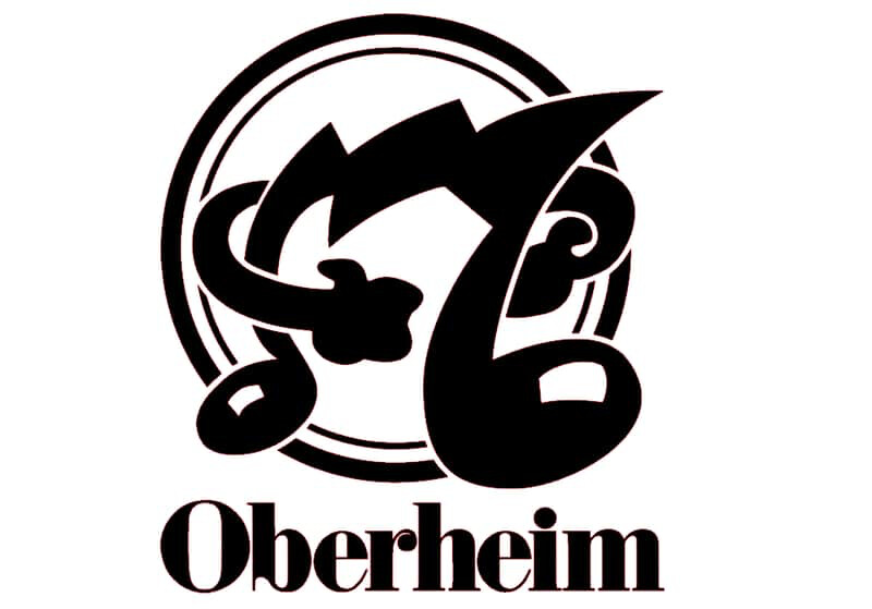
I love you and your synths Tom… but this is absolutely horrendous and should have been killed with fire the minute it was born.
14 Likes
No! That’s a great logo with lots of character!
6 Likes
If you’re blind maybe.  It looks like what someone’s cousin would draw for a local mom and pop’s music store and nobody gave any feedback.
1 Like
Sorry. I don’t know any logos that I don’t particularly like, so I’ll share what I do like.
I’m hit or miss on Roland gear, but I really like the logo.

The stylized R reminds me of the Sega font.
I also like Yamaha’s logos and the slight differentiation between the music and motors sides.
I do like the Sonicware logo though. The way the letters alternate in an interlocking way is satisfying to me, though hard to read clearly.
Ok. There is one that I don’t like.
Analogue Systems probably makes fine things, but this logo bothers me.

Reminds me of something I would’ve etched onto my desk in middle school or something. Actually, now thinking about it like that I kind of appreciate it more!
6 Likes
I can hear the Sega logo every time I see it ^^
7 Likes
Hmm, a few of the best logos in music tech in here…
Anyway, ASM’s old one is bad:
But the new one isn’t a whole lot better:

6 Likes
So, all gear logos are just bad?
2 Likes
It‘s the worst to me, such an expensive instrument and then the letters too big, the f almost clips into the edge of the case … cheap a f
10 Likes
No, I wouldn’t say that. Yamaha has a nice logo, the trio of tuning forks in a circle, I really like this … and Access Music, maker of the Virus synth, has a really cool logo as well, it has this biohazard cyber aesthetic and it is very pretty … the way it lights up, when you activate the Virus synth, is just wow! 
3 Likes
I guess it‘s like the thread about the most beautiful synths and the most ugly synths, which contain the same synths
4 Likes
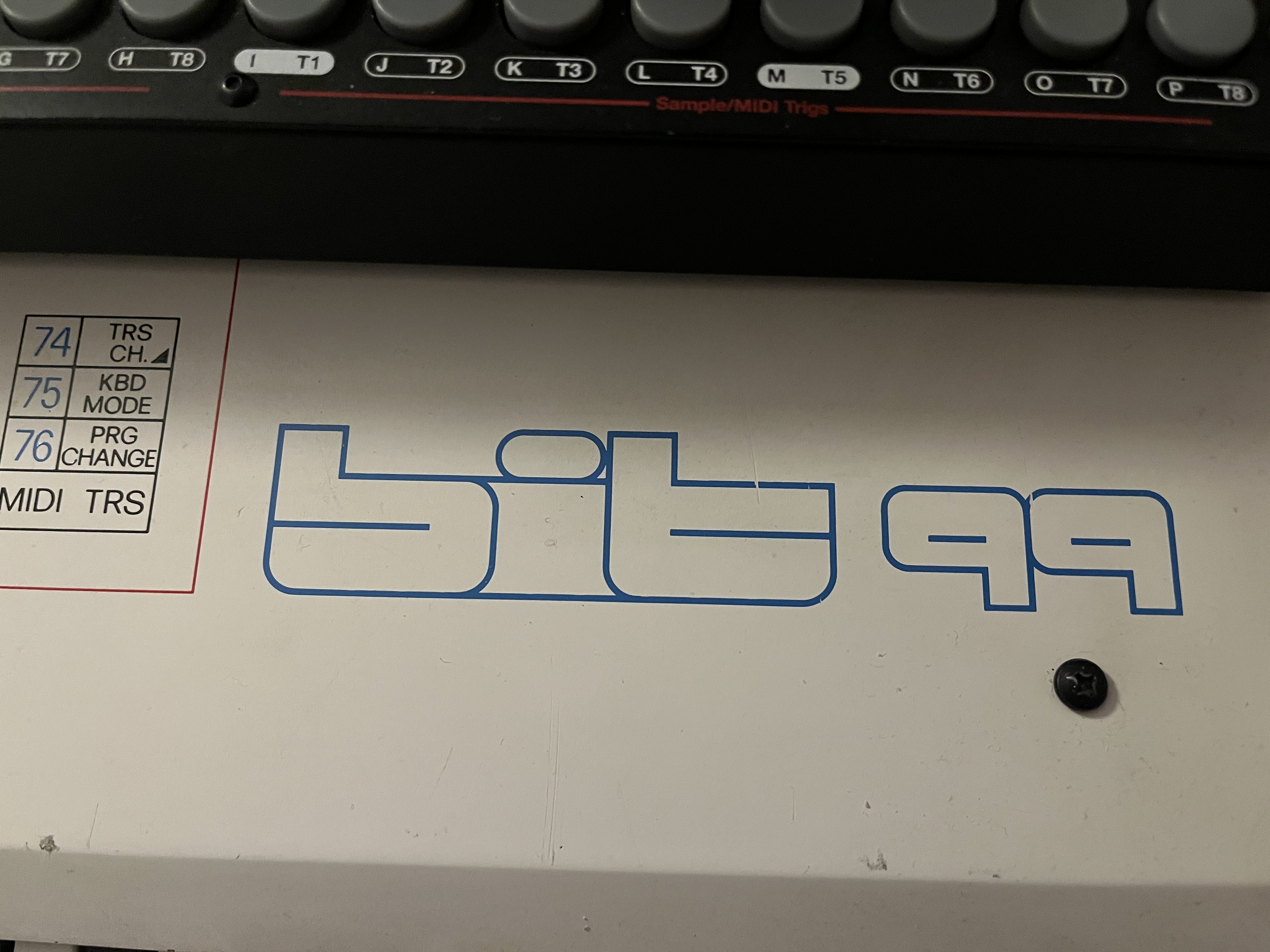
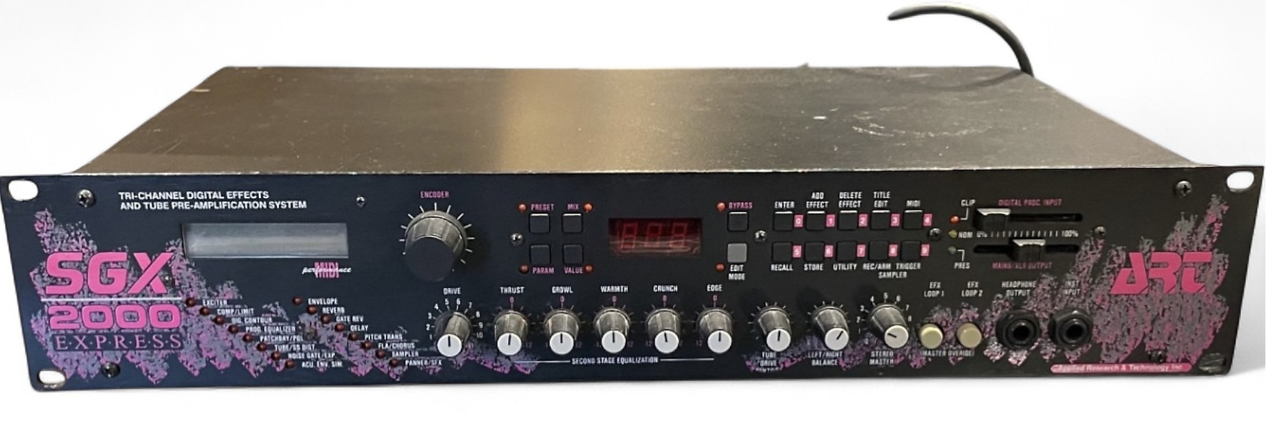
Lexicon: have no problem with the company logo (maybe a little boring) but the typeface for the Alex FX processor always bugged the sh*t out of me.

4 Likes
Why not a Best logos in music tech positive thread?
11 Likes
Are there any?
1 Like
Wow, that thing looks beautiful! 

Korg is quite cool
7 Likes