Wholeheartedly agreeing! It needs to be acknowledged that companies like Akai, Polyend, Native Instruments do this all the time and no one bats an eye at their fresh paint jobs. The community has put Elektron on a pedestal owing to their previous achievements and association with certain artists. Now any attempt they make to maintain their economic footing in this niche industry gets seen as a “cash-grab”. Bottom line is, all companies have the same primary agenda: increase their shareholder value. But fans constantly demand both “a blast from the past” AKA “release MnM and MD” but simultaneously want the company to be “forward-thinking” and create something out-of-the-box: essentially muddling the messaging.
18 Likes
Love the looks! It’s not for me though, but if I were in the market, I wouldn’t mind the 50 extra. The white screens and buttons are what’s doing it for me! And the best upgrade of all: no instrument labels on the DT tracks!
What I don’t understand is how some people in this thread can feel so entitled, as if they are owed something. It’s Elektron’s birthday and they just kicked off the celebrations. They’re not obligated to give us anything. In fact, they’ve given us so much over the years already!
Happy anniversary Elektron! 
6 Likes
In recent times, Akai have usually accompanied a new device or new coloured device with updated OS options that benefit existing owners too. Maybe Elektron have a similar plan in mind.
Don’t follow NI, etc, so can’t speak about their products.
G
I don’t particularly disagree, nor am I looking to argue but maybe no one bats an eyelid at Akai and NI because their bars are already comparatively much lower and are brands with long histories of laziness while Polyend churn out plasticky stuff with multiple production defects. In other words, folks don’t comment as they simply can’t be arsed and have an inner Robert Downey Jr meme eye rolling going on.
I like this the most so far!
8 Likes
that looks nice 
1 Like
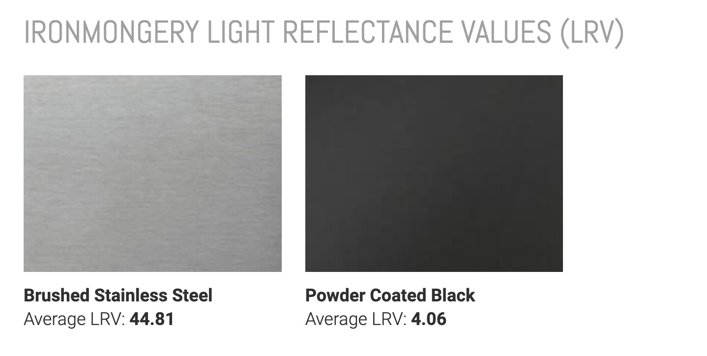
This is how I like it, with sides and backplate in black, I’ll also anodize the panel after the brushing to get that super matte finish (bare brushed metal is a fingerprint magnet) but on this front facing picture you cannot tell that the panel is shiny… However if they used stainless steel then I guess that’s not an option…
Yes!!! I have been looking for this ‘version’ and it does look much better to my eyes.
Especially the fact that the Screen is already black and makes nice contrast with black buttons n knobs. And more in line with MD n MnM which I would think this is what this re-colouring is referring to a bit…
On E25 version, there are like 3 or 4 shades of grey (panel and 2xbuttons and probably the knobs have different grey). For me, it’s like eating a 3 day left over kebab. Just realising, these E25s look like the models with all that grey 
17 Likes
You’re right! To my eye at least, that is 100 times better than the forty shades of grey. 

Or is it 25 shades of grey?
4 Likes
Eyyy @Dataline hope you’re having some cake this week. Despite leaving, your work at Elektron has been the reason many of us got into the machines❤️
4 Likes
Honestly – I think they look cool. At first glance I was not into it, but giving it some time and thought it makes sense to me. Aesthetically they look like some strange equipment found on a spacecraft in a medium-budget sci-fi movie from the 70s and I’m all for that.
But more importantly, why not go a little wild with a special edition – I think the black-on-metal look would be too on the nose, too easy. I like when special editions are a little out there, it’s an opportunity to make something that doesn’t have to conform because it’s limited anyway.
48 Likes
Admittedly, Akai have never provided me with a power handle that had to be recalled or two devices with buttons in the wrong places. They have, however, supported the current MPC range with more updates than any similar device I’ve seen previously.
Been considering a Syntakt for a while and like the look of this new one.
G
2 Likes
 touche!
To be fair to Akai - they did get their shit together and have had a bit of a golden period but those pre MPC Live days could easily give you a thousand yard stare.
2 Likes

No, he still works at Apple.
this!
there needs to be contrast in the UI. Not a plane grey area…whats going on with swedish design guys. You guys where at the forefront once 
2 Likes
These look gorgeous 
1 Like
Woah - Some like it and some don’t. It’s almost like taste is a thing
17 Likes
Are the dollar prices different? In the UK, the price difference is £100 between silver and black. That’s a fairly significant chunk of change.