I need to try it to know, but I’m quite certain I will not hate it either.
Most of the layout is fine - it’s got good gestalt - but this row is unforgiveable to me. The right hand side (Navigation and paging) should be nudged down to align with the bottom of the transpose button. I’d also personally nudge that whole section to the left slightly as it would align the yes/no buttons with the trig button, and the fill/page button with the 16th step.

It’s can easily be improved IMO, with no drawbacks - and I’d be surprised if this had any tangible impact on the PCB.
It isn’t bad enough to put me off owning the thing, but it aint right.
2 Likes
Ok so there is one minor drawback. That’s that when you do as I describe the directional buttons lose their alignment with the function buttons. I think that this is still a better trade off. At the very least nudging them down has no negative impact.
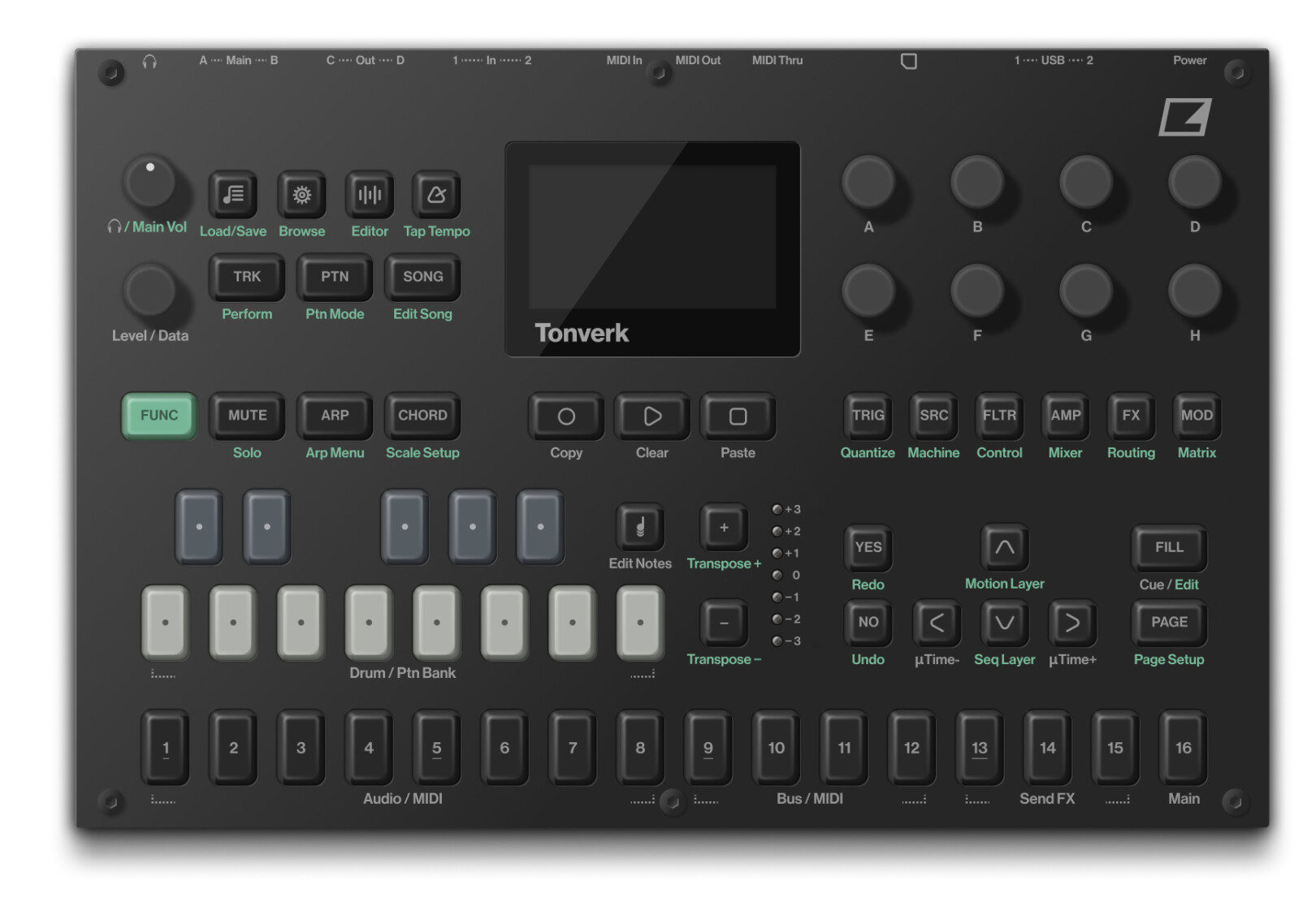
That said I can see how and why they ended up wrestling with this - choosing to vertically center this block isn’t the craziest idea. It is a bit of a pickle.
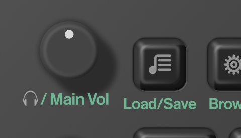
i’m most annoyed with this 
11 Likes
Oh good lord I somehow didn’t even notice that 
1 Like
I’m trying to stay out of this but that is poor. 
Tonwank
When I see lots of those « reworked/improved design » I’m convinced that beauty is different for everyone.
For god sake elektron anounce and release that thing. Seems ready to go, who knows how old those pictures already are.
You need the money, we need the box. Release, videos…new thread where people complain and everything is back to normal mode.
1 Like
I think you’re both not seeing what the actual alignment is supposed to be, partially because the render isn’t perfect.
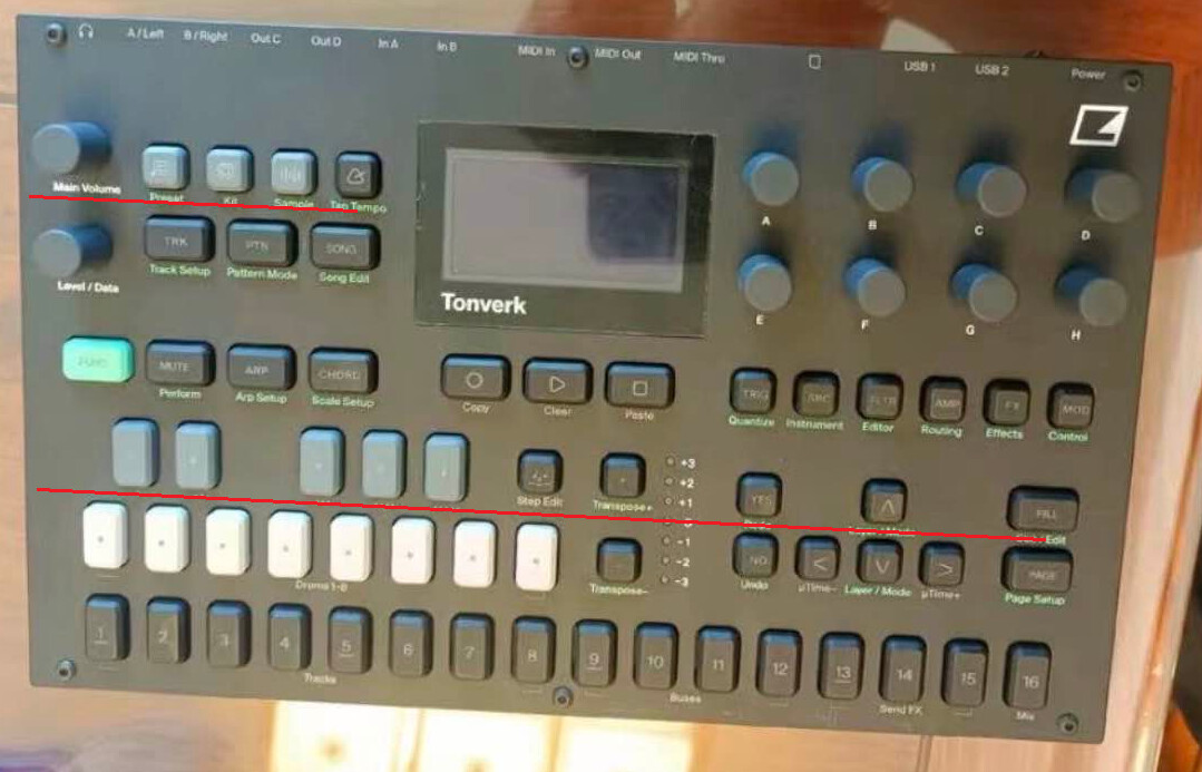
The nav and settings cluster are aligned so that the centre runs along the middle of the keys and vol/data knobs respectively. If you look at it like that I think it might feel a lot nicer to you. Overall I think it looks quite balanced.
1 Like
No, I see that. That’s how I aligned it when I drew the buttons.  I’m just annoyed that the text isn’t aligned. But it doesn’t really bother me. It’s just a detail. But yes my render isnt perfect
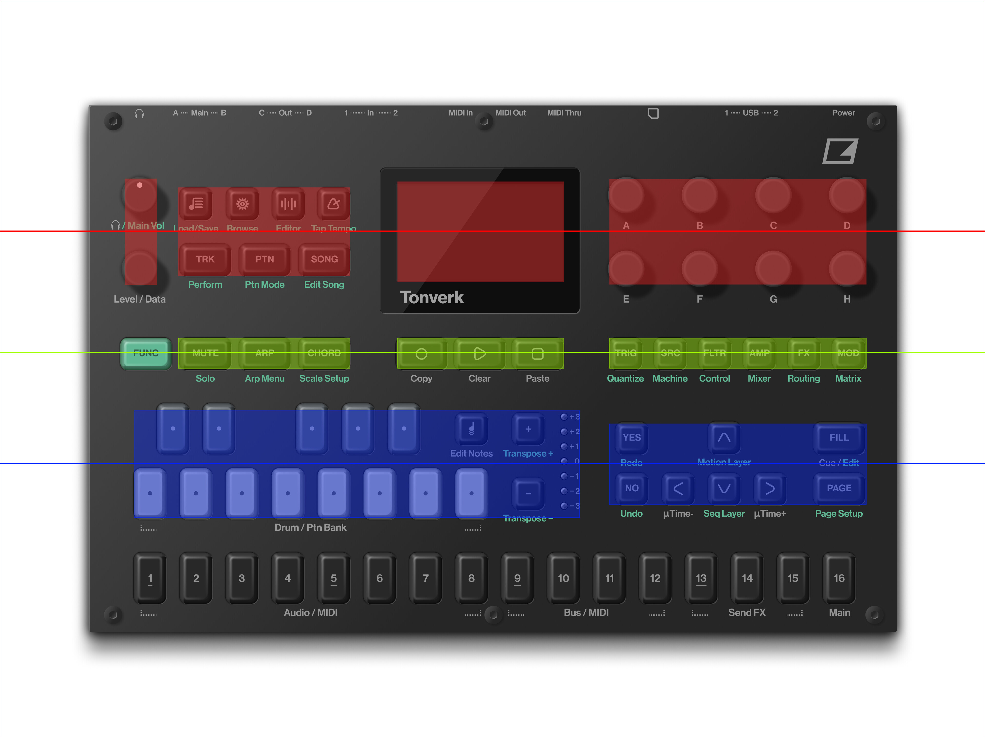
you realize that these not aligned on DN/DT/DT2/ARmk2/A4mk2 as well? 
4 Likes
i think their layout strategy is to center align groups and optimise for ideal button distances, otherwise you’d compromise that. if this render is correct of course
12 Likes
Yea I mentioned in my follow up comment that the block is vertically centred, but I don’t think that’s a better approach personally. They’ve backed themselves into a wall either way there’s no way to bring visual harmony to this situation.
1 Like
Yeah good product design is all about choosing the optimal set of compromises. I think they did quite well personally, though maybe another OT-sized box would have been ultimately better. Maybe they just wanted something that would stand out a bit more from their other devices.
3 Likes
I don’t want to that guy, but…
… white oled?
… FAULTY white oled again?
…let’s say goodbye to all octatrack 3 wet dreams we’ve ever had…
THIS will do…it…all…in one way or the other…
and it looks like, it will do synthesis AND sampling all in one same thing…
ot functions, synthakt functions, rytm functions, machinedrum functions…
just no insert fx and crossfader functions, i’m afraid…
1 Like
I’ve fixed WHITE on Syntakt with color film. I think I’ll put colored green film on the tonwerk, too. fortunately, so far the screen itself shows no issues.
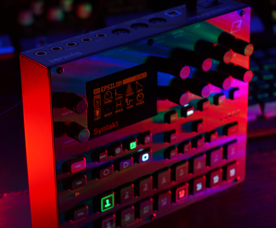
6 Likes
…and yes…for everbody nitpicking on white…as long it’s white on black, any colour of ur choice can be easily achieved with a quick self fix…like @blaq shows here…
Perhaps page is not relevant anymore and tracks are based on steps only. Note there is the motion page. So I suspect note seq and param seq could be seperate from each other.
I’m so glad I’m not a “professional” designer.
4 Likes