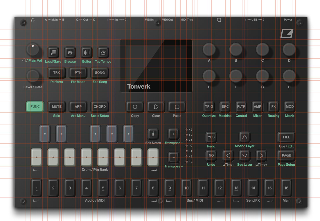
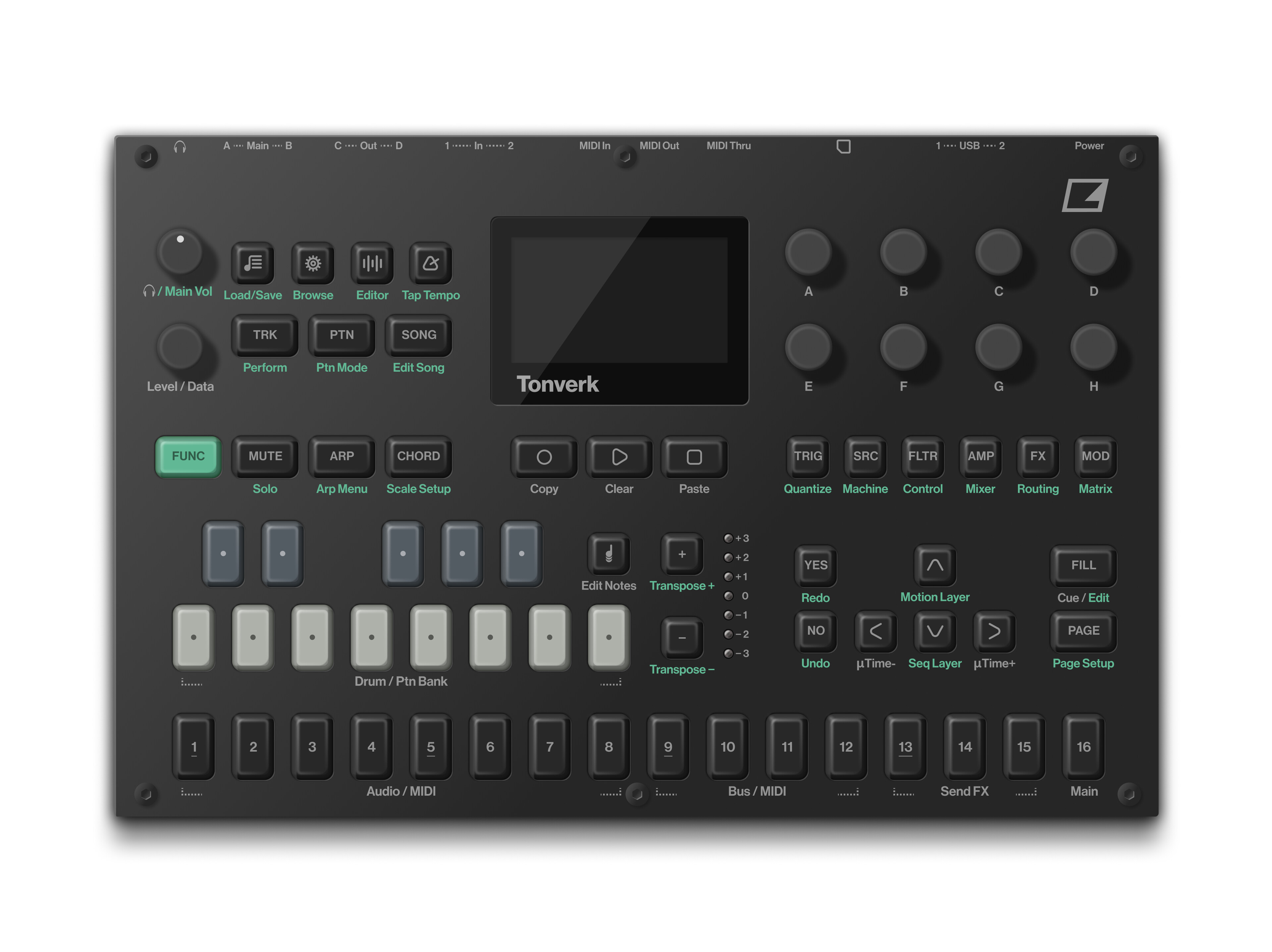
I’m only here to poison the well.
2 Likes
I’m sure those were Loopops trainers in the photo
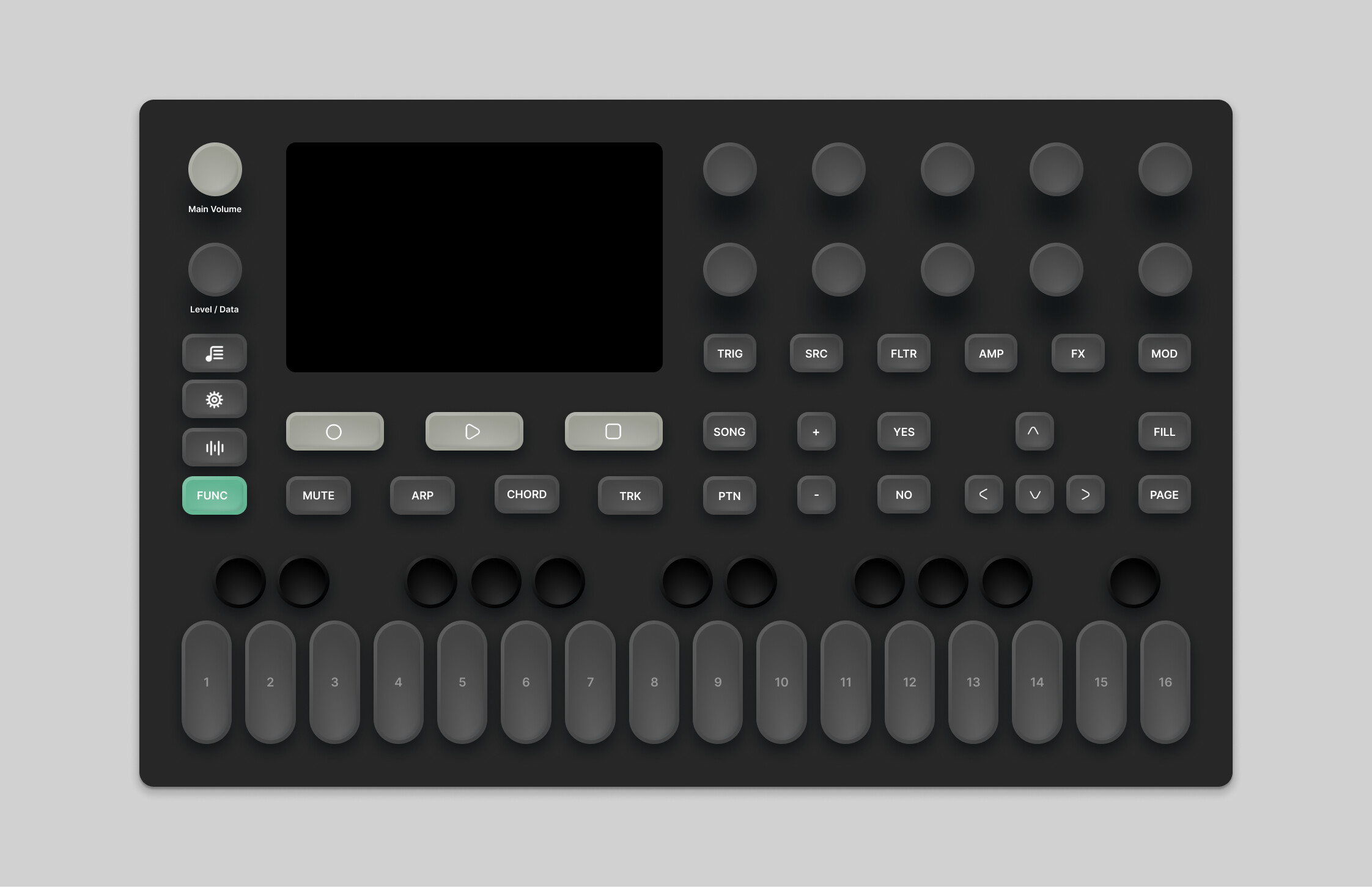
Here’s one a bit closer to the prototype. Still two more knobs, quite larger screen, and more octaves to play on the bottom plus visually for me works better.
It’s not as uniform as I’d like but maybe it helps more with the clustering of areas and definitely you’d have more space for performance with the knobs on this version.
10 Likes
Looks like a Polyend product
3 Likes
I don’t see that as a negative thing. 
tbf, strikes out the Innovative part though… 
but this render waaay better in every term, I would also argue that page/fill buttons needs to be bigger but overall this looks much better
I dont have much against polyend, but their idea of updating a product is to release a whole new product and forget about the one they just made.
2 Likes
Yeah they have some sketchy practices and I hope they learned their lessons and do better in the future with that in mind.
I like the visual of this but usability wise (muscle memory!) this is a big step backwards. You have almost no grouping here but 10 buttons of same size, shape and spacing in one row. Knobs are similar. The arrow buttons are positioned totally counterintuitive. My fingers would never learn to hit the right one here. I’ve learned in my job as an Architect over time that some things are more important than sticking to a grid.
6 Likes
Meh. No profit in bug fixing.
I just found out about this. From a few clips I saw it looks pretty sweet and seems like perhaps it’s some polyphonic sample based synth?? Either way looks exciting.
1 Like
I prefer the traditional Elektron aesthetic. Each to their own i guess.
2 Likes
Yup sticking everything in a grid feels pretty standard for designers just starting out haha
There’s a lot of fields that involve design and you see the same things repeat when a person first starts.
First it’s the rigid grid, then swings the other way, then “function focus” without care for usability etc (let’s add a button for everything).
Then we’ll be cool and avante garde and “people will just have to learn” but nothing is intuitive.
Then you settle into - my job is to convey information and to make something easy to use and intuitive. This often requires thoughtful layout but can’t just be “make it all line up and call it done”.
Then the reality of production needs to be factored in too…
Can we make a new screen even tho all our other products use a different screen?
Do we make the unit have a bunch of different button shapes/sizes meaning we have to manufacture or buy those?
Etc etc.
Design is form + function. Good design is hard.
There’s usually no right answer, but often there is a wrong answer 
25 Likes
And Oct 8 ??
Ocatrack 3 confirmed
8 Likes
Cool to see you progress thru the iterations. One thing to think about is definitely muscle memory/zones. You don’t have time to think which button ur pressing while playing live, so often spaces between zones can help break the UI up. This makes it easier for the brain to hold a mental map since it doesn’t need to remember each button but just each zone.
I’d also suggest thinking about materials/manufacturing. EG In your image there are a lot of different buttons shapes/size. These would all need to be manufactured and would increase cost.
Obviously it’s just playing around but just wanted to give some feedback since it’s cool to see people figuring stuff out.
1 Like
brilliant write up
edit: btw now that I recognize your profile pic, did you work on the Vancouver House?
Hope they don’t include those Syntakt hihats. At least looks like you can replace with samples
Regarding zones -
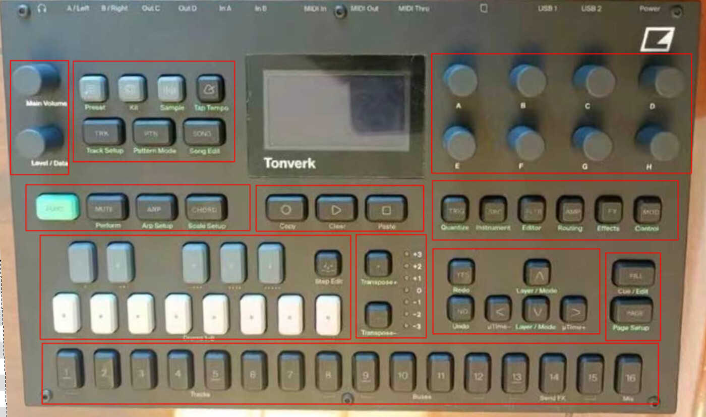
I can understand why someone who’s really into neat aligned design might be confused as to why Elektron designed it like this, but there’s ‘method to the madness’. The key to a good electronic music instrument UX design is helping the user develop muscle memory, so they can perform actions FAST and without having to look for a specific button or function.
Aesthetics are secondary to this, always.
23 Likes
Aesthetics are never secondary for me.
You can have both form + function in equal measure. I understand the division of the clusters but they are so distastefully done on the Tonverk and hence my initial reaction.
I guess let’s agree to disagree. If you think Tonverk is a good design then it is what it is. Buy it, enjoy it and have fun when it’s out.
1 Like