Hi everyone!
After spending some time with OT MKII, I started to think about how I would improve it’s interface. I made an attempt to re-draw main screens: simplify the menus, bring some bigger Digi- style elements, clean it up the from dividers, windows and pop-ups, improve usage of screen space and add some useful info without changing workflow patterns or bringing any new functionality. So, only visual changes and tweaks, like a re-skin.
This is just an experiment for fun and I do not claim making it better in every detail, some decisions may be questionable.

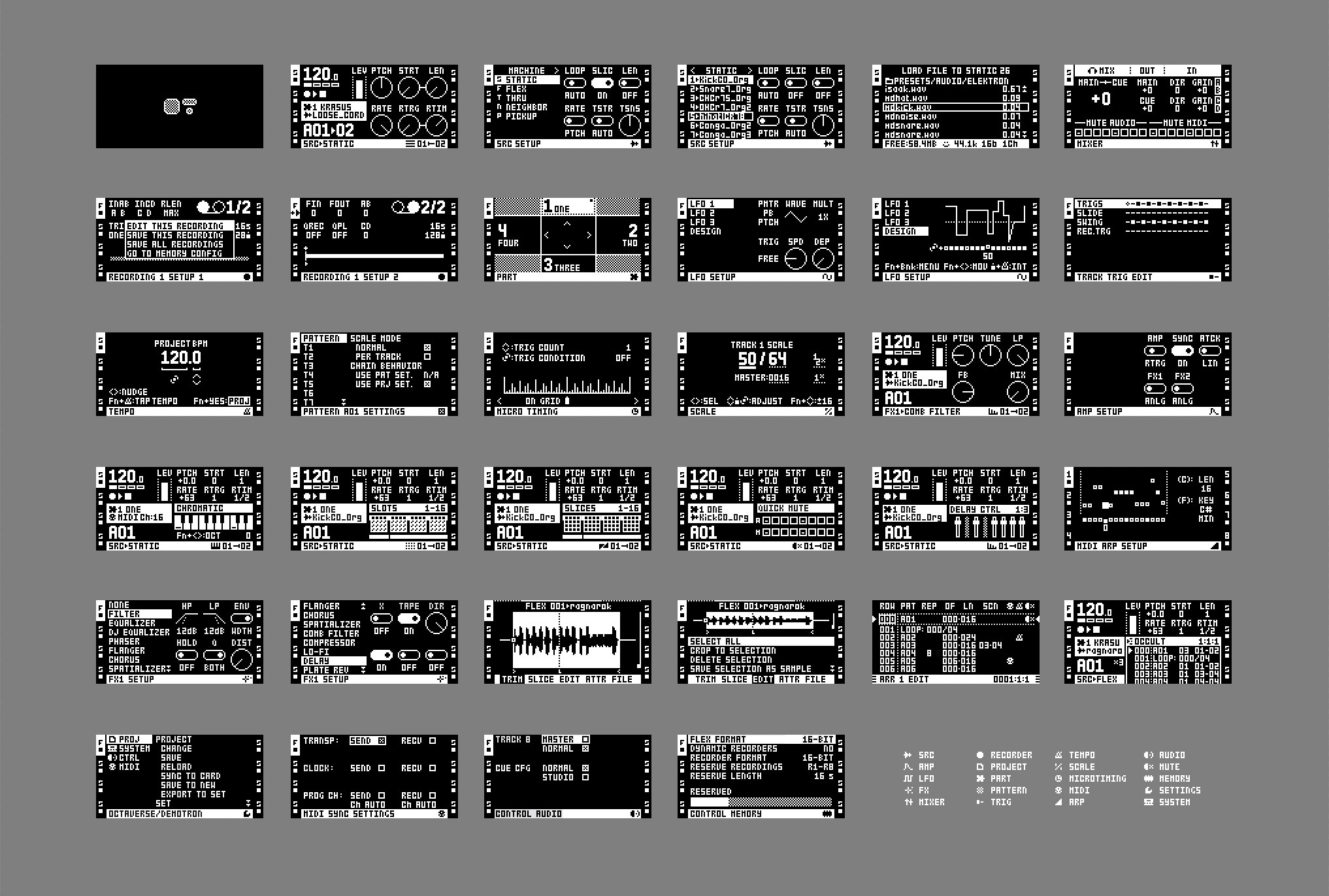
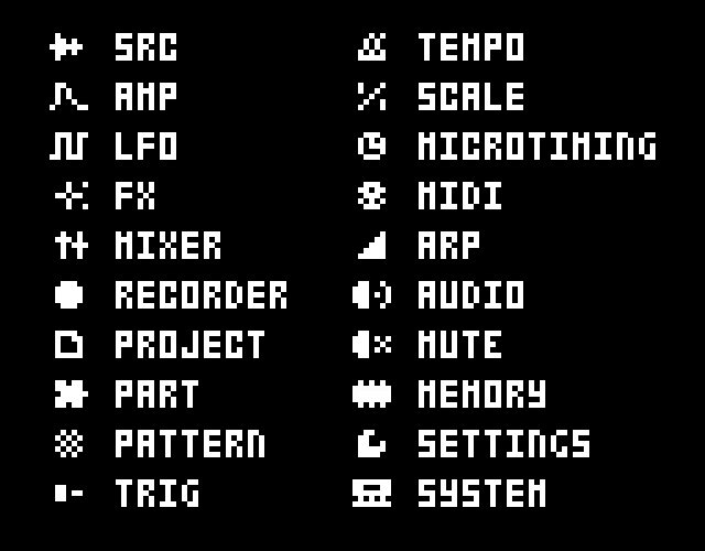
Icons is my favourite part of it. They are similar to the existing ones for trig modes, but now they are for almost every page or menu.
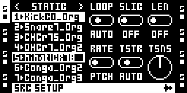
SRC page and SRC setup
Bigger text for BPM and pattern, knobs and toggles from digi- machines, puzzle and waveform icons for part and sample.
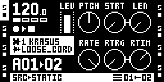
Every menu is fullscreen, no overlaying windows on top of each other.
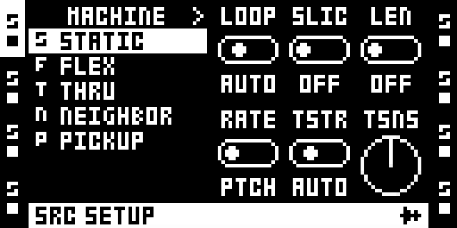
Sample slots list now fits 7 samples on screen instead of 6.
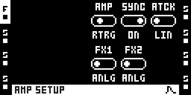
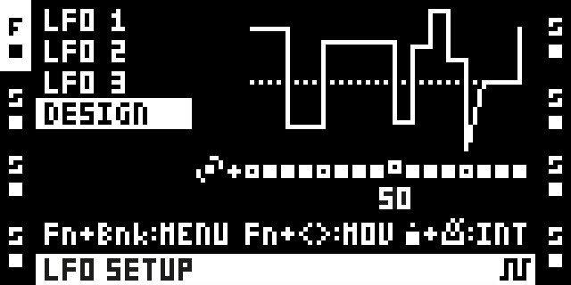
AMP and LFO setup
I removed these big illustrations on the left that may be confusing (it’s even mentioned in the manual that they are not interactive)
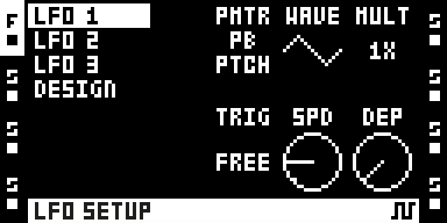
LFO Designer can fit an additional row of key combos underneath.
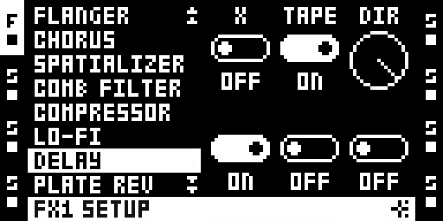
FX
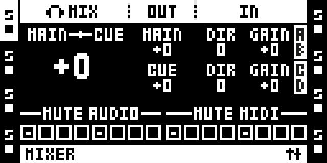
Mixer with slightly different layout
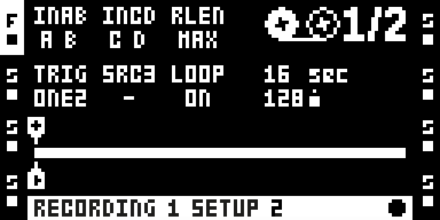
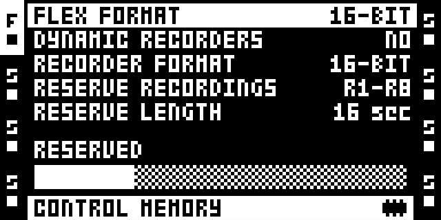
Recorder
“Record” and “play” icons added to corresponding markers on timeline (instead of just arrows)
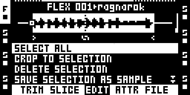
Audio editor
Little start / end arrows and loop sign instead of S-L-E which I always find a bit confusing, because they correspond to A-B-C knobs
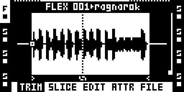
In edit / attributes / file tabs it would be cool to shrink the audio preview to show it together with the options list.
MIDI arp
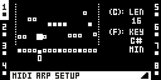
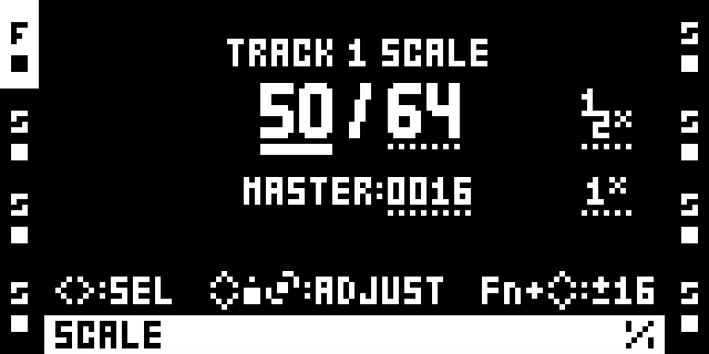
Tempo and Scale with tips for combos
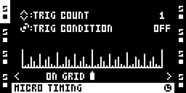
Microtiming
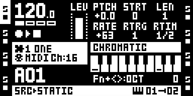
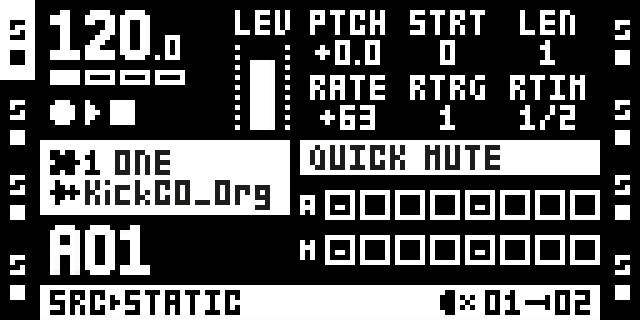
Chromatic & Quick mute modes
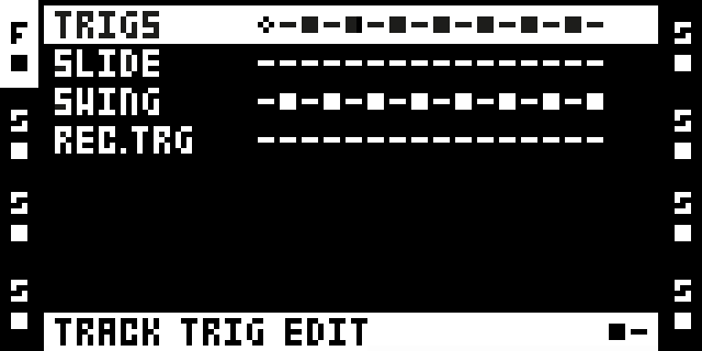
Track trig edit
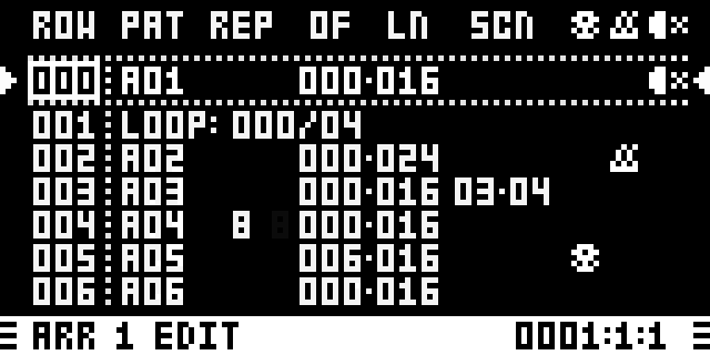
Arranger
Now it can fit 6 rows instead of 5.
Midi, BPM and Mute icons instead of T-B-M — I keep forgetting what these letters mean.
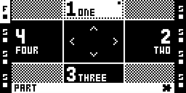
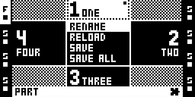
Parts
This one is weird
Options list fit inside central segment instead of popping up
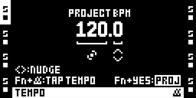
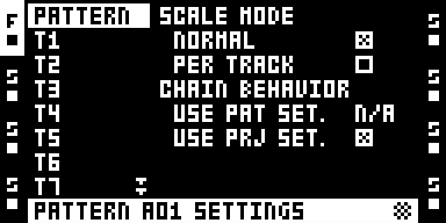
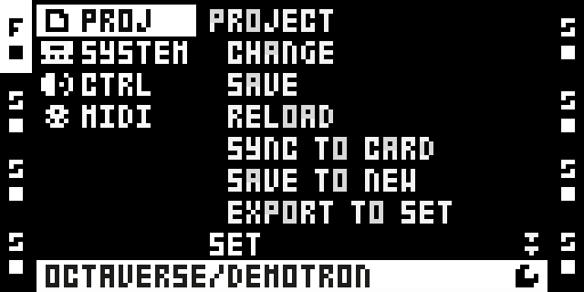
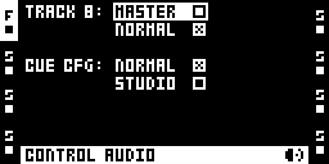
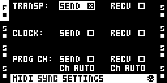
Some Pattern & project settings screens
This exercise turned out to be a great way to study the device — i finally explored almost every single function and page of the manual.
What do you think about it?