The shadows on the buttons are totally wrong. The top ones are lit from a different angle to the transport ones at the bottom. Seems super suspicious to me. Great specs though.
2 Likes
That takes discipline that I lack but admire in others. To me, looks play a massive role in how I connect with an instrument. I walk into my studio and I admire my black KeyLab 88 mk3 because of how nice it looks and feels with those wooden sides and sturdy, matte black metal finish with no excessive use of colors - and it’s not even a proper instrument, it’s just a midi controller! And I love the dramatic look of the Digitone II with its metal case and those LEDs that are uniform in color instead of a full rainbow palette. After years of using it, I still sometimes turn on the Syntakt just to admire the looks of those trig LEDs. ![]()
Conversely, as much as I loved the sound of the MC-101, I hated how it felt in my hands and how clunky it looked despite its small size. (And let’s not talk about the screen…)
I really value attention to detail, quality materials and cohesiveness, and unfortunately the MPC Live 3 looks like it fails on all of those accounts on first glance.
2 Likes
Yeah, it looks weird to me. Perhaps we’re in for a surprise in the end.
2 Likes
That touch strip will be great for fading between scenes etc- I assume it will have the Force functionality (even clip launch)- nice. This could be the OT that everyone was waiting for ![]()
yup
Looks like Gabe Miller designed it
2 Likes
So, is MPC-X done? In a lot of regards, spec-wise, this buries an MPC-X. All the buttons and the dedicated clip launch make it seem like they’re consolidating (as previously forecasted). Maybe it’s just a matter of time until we’re down to only 2 MPCs and a force. Or, just 2 MPCs.
Or some other very ugly crazy and powerful thing will soon appear from the inmusic camp.
2 Likes
Nahh, they need to milk the cow and launch the “MPC XY Upgraded SE Christmas Led Edition”.
1 Like
I’m not fully convinced this is legit how it looks ![]()
2 Likes
Sundays always the best days for leaks when time differences or last minute test code goes live before the ‘Monday’ launch ![]()
Havin the units up for sale as its anounced and getting the ‘must have it now’ pre-orders must be worth $$$
1 Like
If it’s well built and sounds good, who cares about its looks? Not me, certainly.
2 Likes
Or the mpc 88 key ![]()
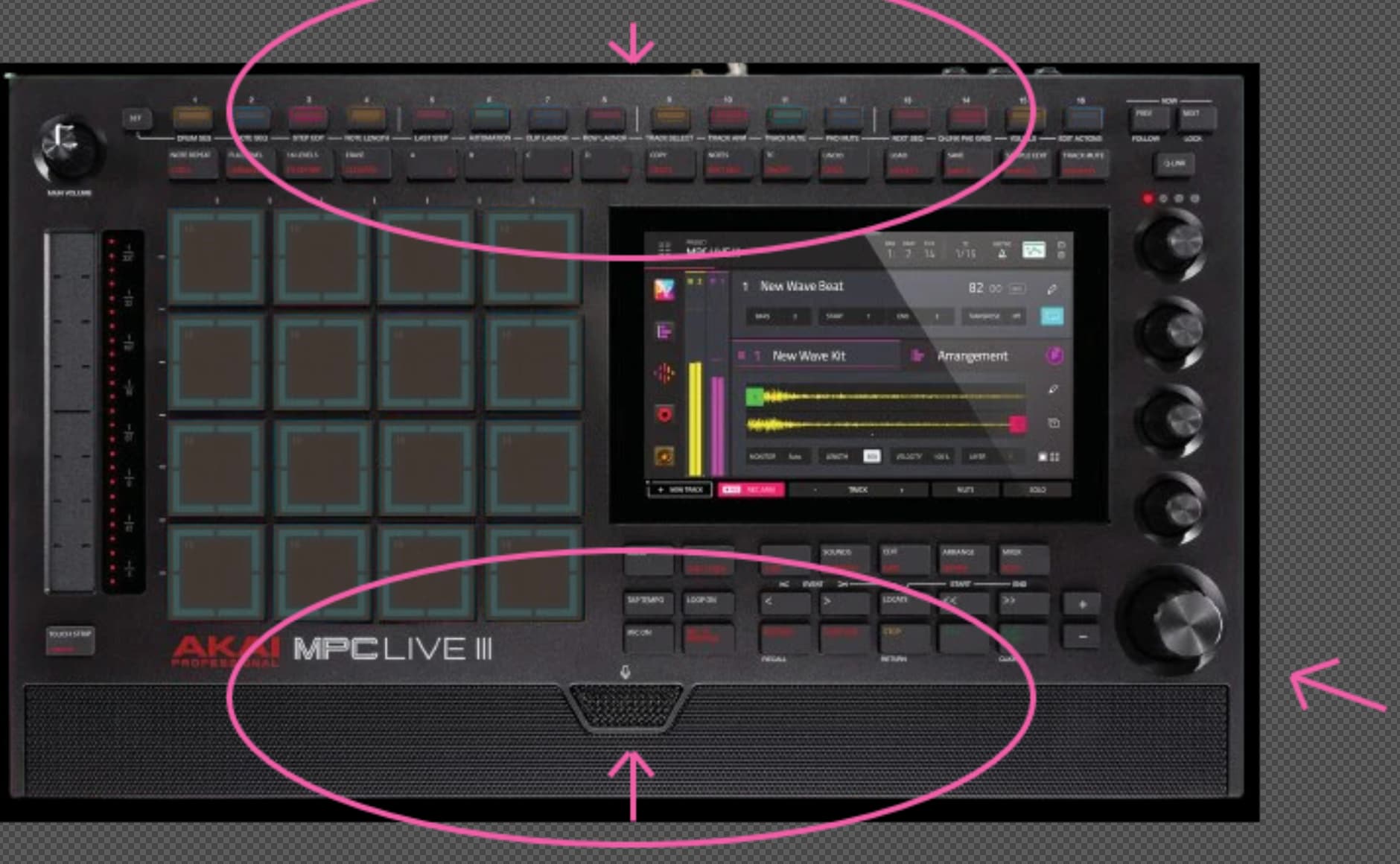
I’m not getting all the fuss- it isn’t that different to the MPC Live II sat in front of me…If you don’t like the way the MPC Live looks with the speaker etc then OK- I get it- but they have just added a cross fader/touch strip on the left and a row of 16 step input buttons on the top- other than that and a few more (welcome) buttons, looks the same to me, and the additions are what many people were asking for. Would it suddenly be beautiful if the touch strip was on the right and the buttons on the bottom (were I rest my wrists when finger drumming!)
12 Likes
I have not tried seeing if they transfer over drum programs ( my guess is no), but a solution, which will only work for future projects, is to save a template with those kinds of q-links you tend to use the most, so every future project will have them ready to go ![]()
There are 3 primary light sources - not unusual for studio lighting and product photography. I don’t think that’s sus personally.
2 Likes

It’s something you have to interact with and stare at for hours - it may not be more important than how it works but there is a lot of well established science in the benefits of surrounding yourself with beautiful objects and how it impacts your mood and creativity.
Which is why I hang out here with all you beautiful people.
4 Likes
But it can’t be that ugly that it would impact anyone’s mood or creativity, right?
A bad workflow would certainly impact mood and creativity way more than a less than ideal looking device, imo
2 Likes
For me? Nah. It’s less about “its too ugly for me to be happy” and more, “if it were better looking id find it more alluring”.
It’s the UX that bothers me more, I don’t hate how it looks but I find the steps on the top eye-twitching.
3 Likes
on an MPC steps at the bottom would get in the way/covered by your hands playing pads etc.
edit: better edit ^.^
3 Likes