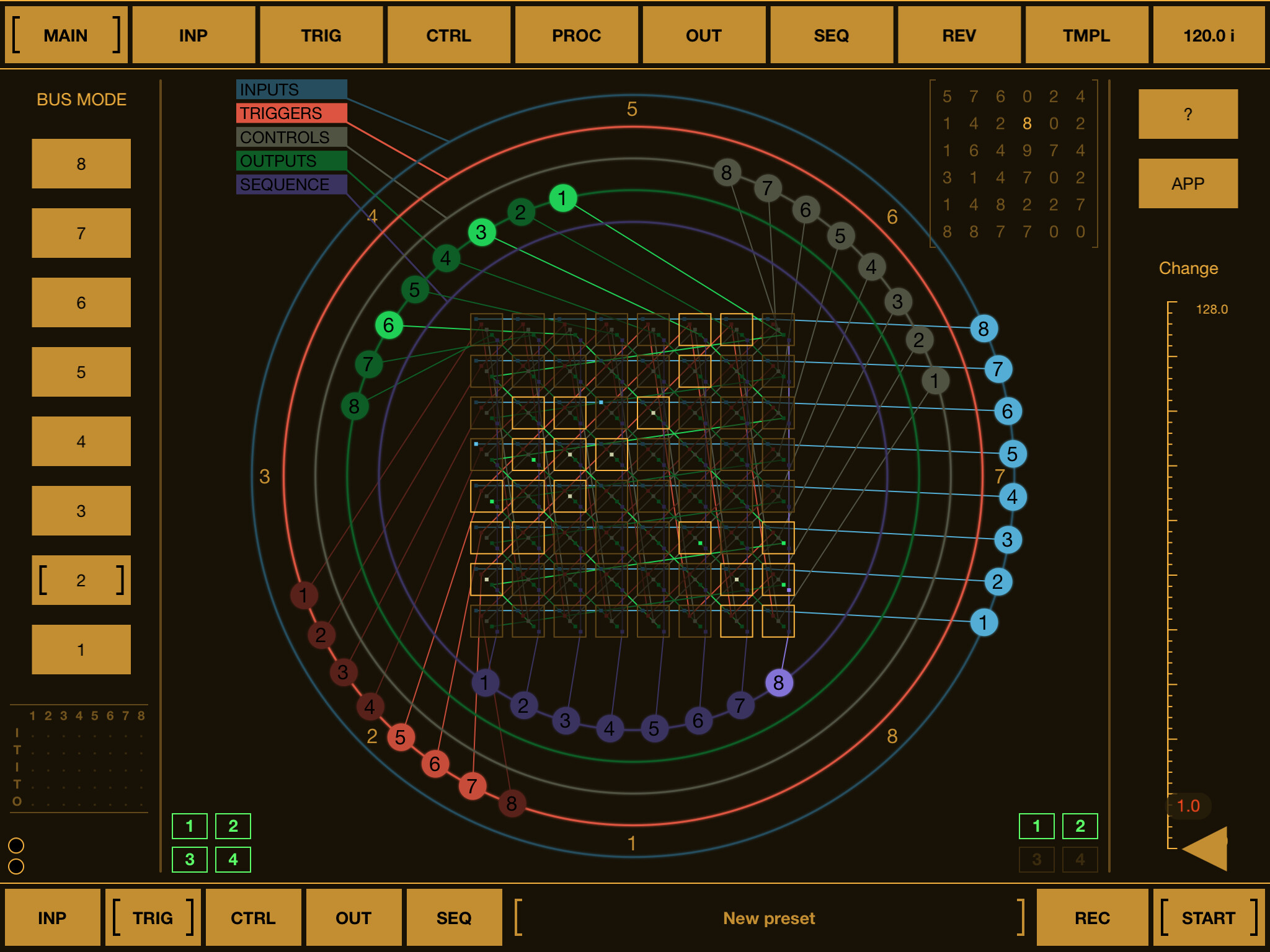
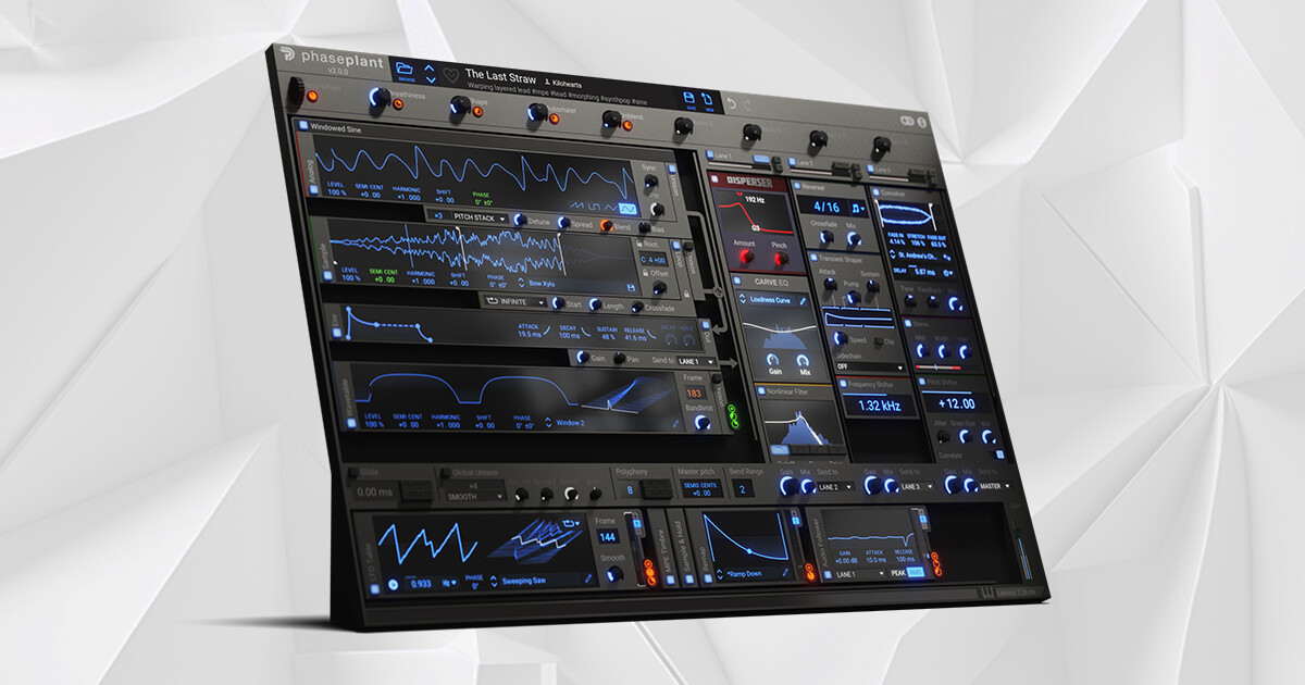
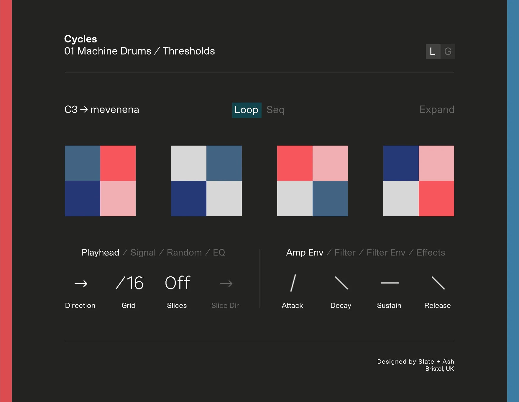
yeah I tried that one too, I don’t know it’s just too busy for me, too many controls, colors, sections, the overall design is not something appealing to me, they are very powerful for sure and very capable but design wise never liked them.
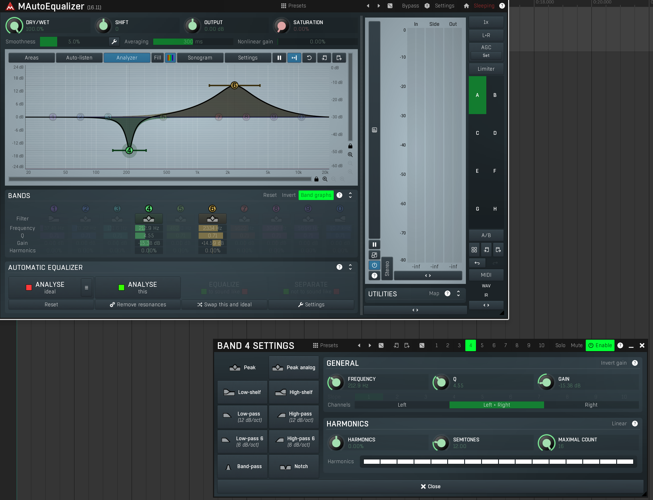
It can be all collapsed, but I actually do use all of that stuff And I think the developer is always interested in improving the experience, and it allows for different workflow preferences. For example, it’s possible to just use the Graph, or use the Bands below, or open a window with even more options.
Just want to express that Melda is really cool.
And I just realised below “Analyse”, it says now bluntly “ideal” and “this”
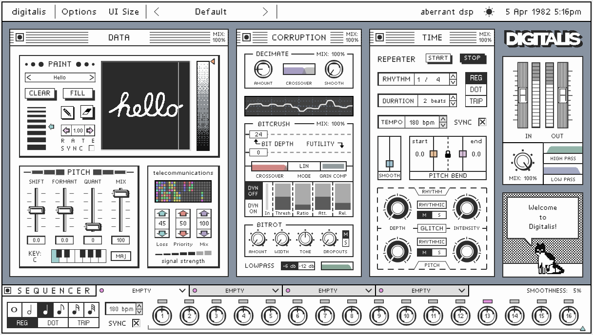
I love the app-designs of Igor Vasiliev. Impenetrable at first, but somewhat functional when you learn to read them. (I know not everyone like this, but I find the slight “mystery box”-approach to his apps fun and inspiring.)
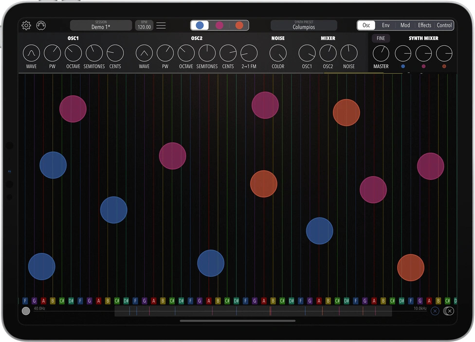
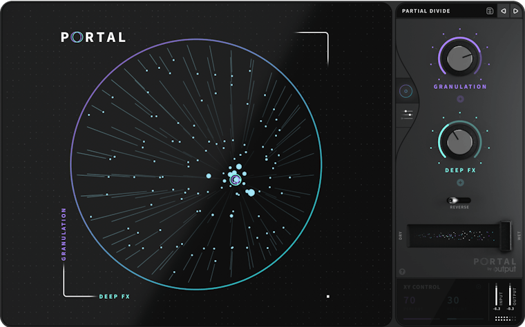
Interesting thread as I honestly don’t consider many of the ones posted as visually appealing to me, just goes to show we all have different tastes! I personally like the more minimal approach, so Ableton stuff appeals, and a touch of abstract minimal beauty to liven it up a little
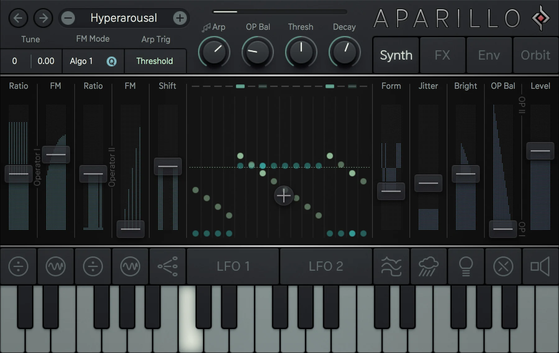
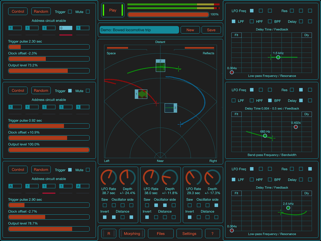
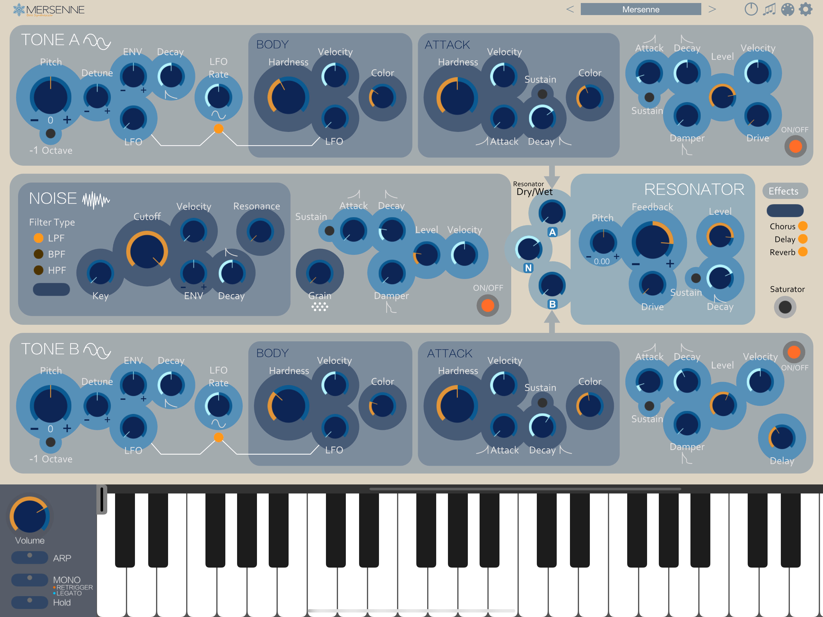
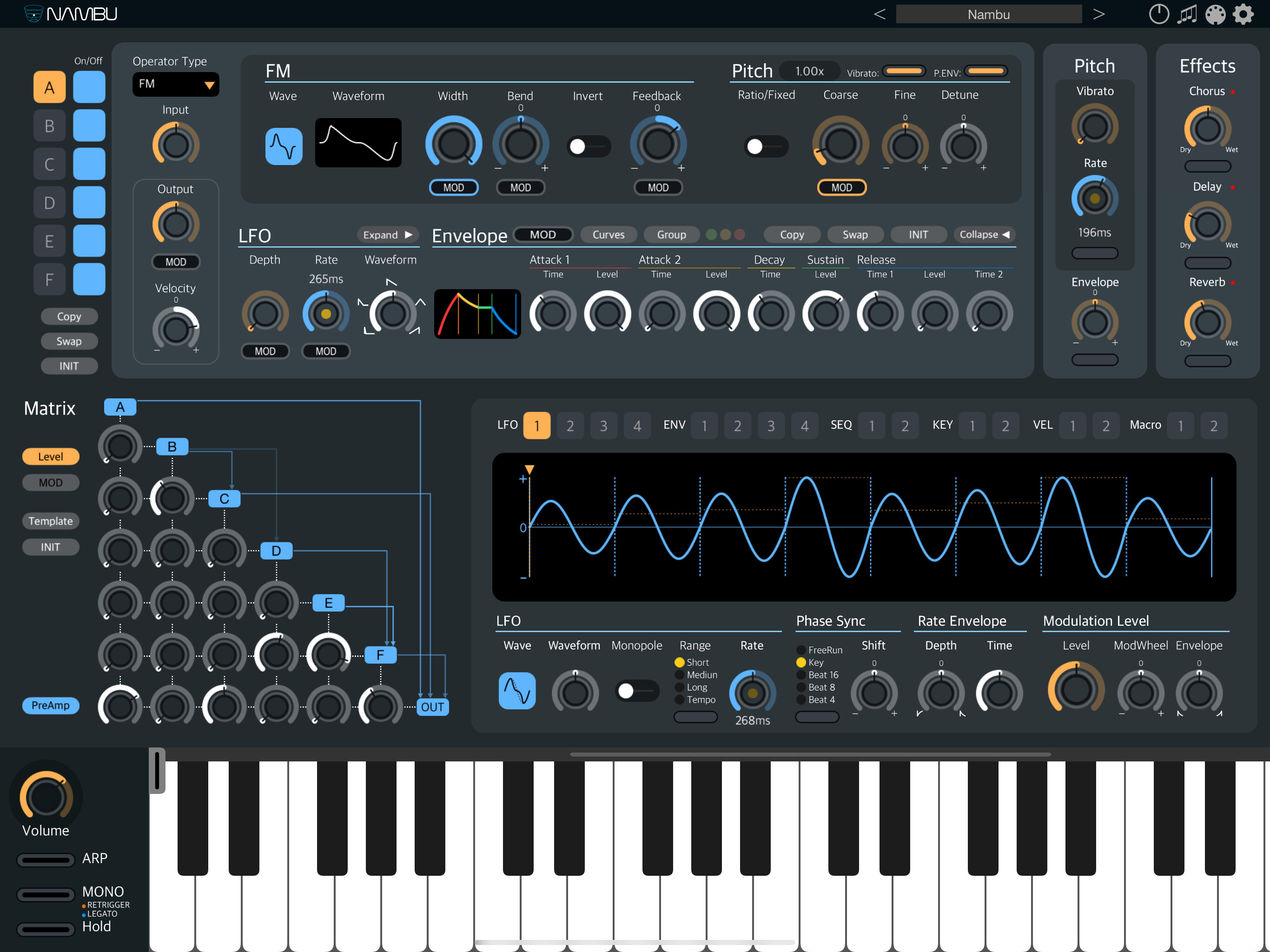
Exactly! What caught my attention is that most of use who posted here have a similar taste: gray/black tones with pastel colors as details. That’s at least how I see it.


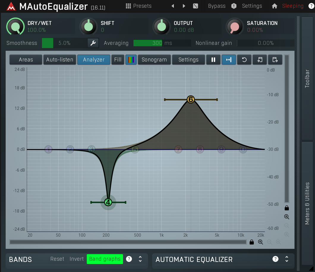
 And I think the developer is always interested in improving the experience, and it allows for different workflow preferences. For example, it’s possible to just use the Graph, or use the Bands below, or open a window with even more options.