This is something I’ve been thinking about recently. I saw a comment online about the Tonverk and how its very dated in its looks and that Elektron should get with the times and use a better screen, colour etc.
I couldn’t disagree more, I get that not everyone likes the same stuff but personally i love the design and aesthetics. I love the simple black and white screen with “retro” UI/graphics. I love the clicky keyboard style buttons over soft pads on something like an MPC. I just generally feel thay Elektron stuff is cool as fuck lol
I’m curious if other people feel the same that the look and vibe of gear is part of what makes you want to make music with it not just it’s features.
Same here. It was so fun to play I made a rare exception and kept it around even though I hated the look of it. Can’t really think of anything else I’ve bought that I didn’t find somewhat visually appealing.
On the flip side, I think I keep my MS-20 mini around mainly because I think it looks like something from a mad scientist’s lab. Not really crazy about the sound of it for the past few years though and am itching to replace it, but can’t quite bring myself to sell it.
they’re important, but I think black elektron boxes look cool so at least for me I’m not bothered.
I’d love better detail on the screen for sample editing but it doesn’t even let you really do much in the way of sample editing so I don’t miss what I can’t have.
If I’d mostly go by aesthetics, my setup would consist of a Drumding, Super 6 and grey Rytm MK II. And FX by CXM 1978 and Microcosm. I don’t own any of them though because they didn’t work long term for me (AR, CXM, MC) didn’t impress me when trying out (Super 6) or surely don’t make sense for me and just tempt me because of how great they look (DD).
Likewise, I’d consider most of the gear I own and use regularly to be rather bland (Tonverk) to downright ugly (Take5). Yet they do the thing they’re supposed to do so well that I begrudgingly accept that they’re not designed for my aesthetic preferences.
When I’m interested in something or something new is announced, I surely GAS harder if it looks nice. I’ve jumped on MPC Keys G2 rather quick recently because I’ve been thinking about MPC since Live 3 released, but the looks of the Keys made me buy it a lot faster than if it looked like the black Live 3. I also have identified the allure of a nice looking object often recently - a well designed piece of gear makes me think of it when I see certain things like a piece of wood that reminds me of it. And it makes me want to own and look at it.
Elektron’s UI clearly is a big appeal for me as well, I find their pixely UI induces fun that will influence the music I make. A lot more than the bland hi res touch screen of my MPC with ugly and generic looking icons for apps that remind me of a Nokia Ngage or early Iphones. Still, ultimately TV and MPC can do great things and that’s the main reason I have and use them.
It’s extremely important to me. First of all because if I’m not inspired to want to look at something and touch it and use it, it’s not going to be a very useful tool for me. Unless it’s something that can be tucked away and you don’t actually need to interact with.
But also I think that good design is a sign of good taste which is an indicator of good decision making in other parts of the company that I can’t directly see like circuit design, software design, overall usability, customer service, etc.
With so much gear in the world, it’s also a nice extra anti-gas filter to be able to ignore entire companies that have bad taste.
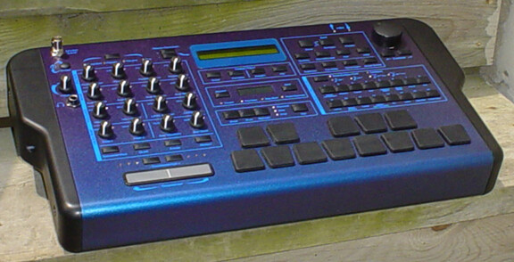
Extremely important to me, I don’t want something I don’t like the look of staring at me all day in the studio. I went to great lengths and cost back in the day to have my e-mu Command Station painted something that didn’t scream ugly pumpkin to me.
Granted 20 something raver Tarekith maybe didn’t have the best sense of color back then either.
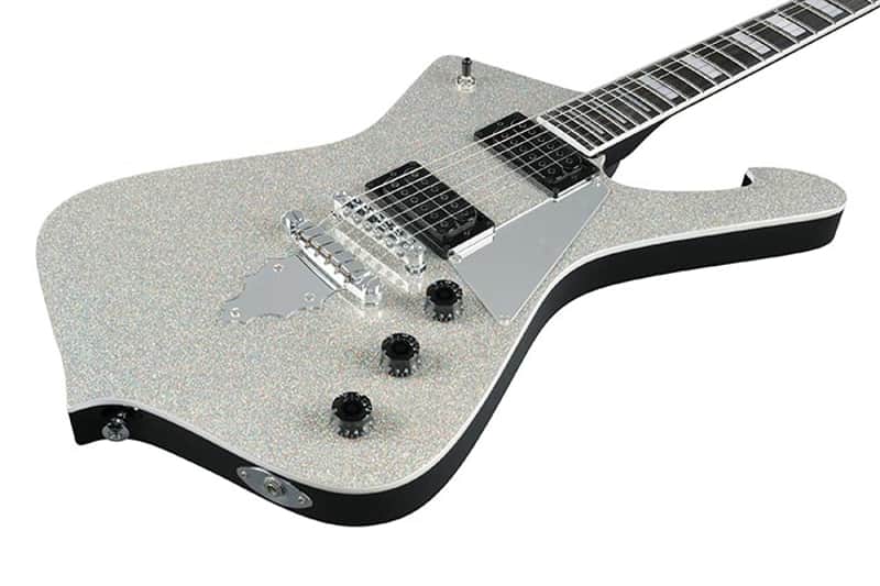
Yeah i care about lot about aesthetics too. I grew up playing guitars and always believed (and continue to believe) that the best guitar for you is the guitar you want to play, and looks are a big part of that. It’s a big part of why the only electric guitar i own at this point is a (relatively) cheap sparkly iceman like this lol
I love good design so aesthetics are important to me with any object I have to either use a lot or share my environment with. One of my biggest beefs with all of Behringer’s reissues is how awful their industrial design is, particularly as they’ve turned some truly iconic looking instruments into absolute howlers visually.
I don’t set the bar too high though with music equipment as I don’t want to eye candy my way out of some cool gear. As long as they get it right, and most manufacturers do.
I really like Elektron’s direction since they abandoned the round button beasts. Not stunning but purposeful, clean, functional and visually encouraging.
This.
Guitarists always pick a guitar they like the look of. And sure thats totally subjective, but you’ll never find a guitarist playing what they perceive to be an ‘ugly’ guitar.
Why should electronic instruments be any different?
I would love to have a Bass VI that is built to spec for Robert Smith. Then I saw it. The schectre RS hellcat vi. Horrid looking thing. I feel betrayed.
aesthetics definitely have sway on me, although most gear doesn’t really even register on the purely aesthetic scale for me. not like a beautiful pair of shoes.
it’s all so subjective. i personally think the tonverk is more visually appealing than the live 3.
Critical for me, I’m going to spend a lot of time looking at it so if i think its ugly and or dumb looking i dont need that energy.
I don’t mind things with an aesthetic like Make Noise. Everything being black and using Helvetica is also boring.
I really wanted a Roland System 8 but never got solely based on its appearance. I just couldn’t handle a giant piece of plastic with bright green lights like some 2000s gamer mouse in my space 24x7.
Blue stripe Oberheim livery is a borderline no for me, powerfully 80s and not in a cool Debbie Harry way, just not for me. I’d probably bend for a sequential one if a deal came up though.