I’ve just got the Digitone II and noticed some welcome improvements not mentioned in the product release.
The page leds are two colors. In GRID recording, the active page is green which makes it more distinct / visible from the other non empty pages in red.
On the Syntakt and the OG Digitone, the brighter led to indicate the active page is less visible for me.
Also, the FM Key Scalings and the Filter Keytrack which were in the Sound Setup menu are now respectively placed in the Synth parameter page (page 4 of the FM Tone machine) and Filter parameter page (page 2).
I find that much more accessible and logical.
I actually think this is not great, when you have two pages one is red and one is green, and I’m not sure which one I’m looking at. I imagine it’s also especially bad for people with red/green colourblindness (quite a high percentage of people)
Well, conventionally, green is for the “OK thing”, where you can go, like for traffic lights.
For colorblind people or people like you who prefer the legacy behaviour, there could be an option like “LED color” in addition to the existing “LED intensity”.
Maybe a feature request ?
Sorry I was referring to the new page indicators. When two are lit, one is red and one is green and they are equal brightness, it’s difficult to tell which is the active one. Red is used to indicate active track. So I assume red indicates active page, but I’m not sure.
When you have only the red color for the page leds, indeed a red but a bright one indicates the active page. The other pages are in a dimmed red.
Here with two colors in the Grid Recording mode, the green color is used to indicate the active page i.e the page you’re looking at. The other pages are in red.
I am red-green colourblind and I find that people struggle with the idea. The red and green lights in the DT are fine for me to differentiate, the issue is with the yellow and green lights, they look the same and that is something manufacturers always do. They should always use BLUE/YELLOW/RED…avoid ORANGE which looks like RED, and GREEN which looks like YELLOW.
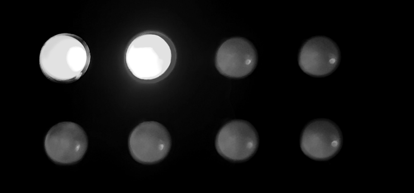
PS, this pictures looks the same to me so no idea what they are demonstrating
Thanks for the first hand experienxe reply. It shows I hadn’t understood your colour responses properly.
The fact the two pics look the same to you suggests the app I used to filter for red-green cokourblind-ness works quite well.
The story I was hoping to tell was that the page lights would have been fine if they were red and yellow. They show a red-orange bowl holding red apples, orange satsumas, yellow bananas. The lower picture was put through a colourblind simulator. To me, that makes the orange and red-orange look like the yellow banadas, and the red apples look dark brown. So I think it hints that I could trust the filter to help me pick colours to support you (if I had such a role. I sometimes do sccessibility work for web projects).
This is my first “Digi” box so not sure if this is normal behavior (or a bug?) but trig length set to infinite, and say with an Arp, the sequence will continue playing through a pattern /kit change, until it hits a trig on the same track. Useful for transitions and such…